
Cool article about Action Condensed typeface created by the guy behind the X-Files logo — Christian Schwartz, of the Commercial Type foundry.
This Sassy Typeface Proves That Fonts For UI Don’t Have To Be Boring
Designed by the guy behind the X-Files logo, Action Condensed is a new typeface that aims to make interfaces more exciting.
From Google’s Roboto to Apple’s San Francisco, there’s no shortage of typefaces optimized for interface design. For better or worse, though, those typefaces tend to be pretty bland. Christian Schwartz, of the small New York-based type foundry Commercial Type, thinks it’s time interface typefaces got a little more flavor. His company’s latest typeface, Action Condensed, is the raspberry to Roboto’s plain vanilla.
Action Condensed feels a lot more dynamic than other interface typefaces. But despite its vigorous and energetic feel, the sans serif is designed to be readable at relatively low resolutions and be just as good as Roboto and San Francisco for use in interfaces. For example, it features four weights with three separate grades (think: boldness) per weight. Despite this, characters in every grade have exactly the same width.
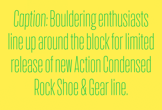
Why is that important? It means that a bolder grade will take up the same amount of room on-screen as lighter grades. That’s useful in interface design, because it allows you to change the state of a clickable or tappable text button, without the size of that button getting bigger or smaller. Imagine hovering over a clickable headline in Action Condensed with your mouse: the headline would get bolder, but it wouldn’t actually get bigger, disrupting the flow of the typography around it.
It doesn’t sound like a big deal, but making characters of the same width—regardless of their grades—is a tricky problem, says Schwartz. “There’s a staggering number of tricks utilized in this typeface to keep weight and spacing consistent,” he says.
It would have been very difficult to manage for some designers, but Action Condensed was designed for Commercial Type by the legendary Erik van Blokland—a veteran Dutch designer whose past typefaces include Trixie, the font famously used in the X-Files logo, as well as Eames Century Modern, a series of typefaces honoring the aesthetic of Charles and Ray Eames. Without the bag full of typography tricks Van Blokland brought to the table along with his decades of experiences, says Schwartz, Action Condensed might have been just as bland as the fonts it’s meant to replace.
Why would a designer use Action Condensed instead of Roboto or San Francisco? Schwartz explains: “It brings a richness and personality to interface design that just hasn’t been there anymore. Why should all interface typefaces look generic and neutral?” Other interface typefaces have a “very quiet voice,” he says. “We think it’s time for something more assertive.”