


Jan Tschichold is one of the most important designers/typographers of the 20th century; the father of modern type. He was a sign-painters son and classically trained in calligraphy. While growing up in Germany, he was a bit of a typographic rebel. With his emphasis on sans-serif typefaces and new typography he fled Germany and the Nazis who believed his views to be in contrast and damaging the cultural heritage of traditional German blackletter typography.
Tschichold’s most notable credits include the elegant typeface Sabon and the re-design of the template used for over 500 books at Penguin Press. His “The New Typography” is the bible for modern type.
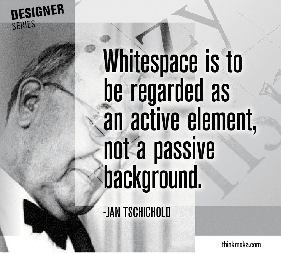
This is a the third installment of Moka Graphics’ “Designer Series”. Please read the other articles and share with your designer/typographer enthusiast friends.
I love history. So design history is a natural topic that I love to study. I’m always curious about the why behind things. Why something was done, created, designed, thought of in that way, always give a certain bit of perspective. This is not exclusive to design of course. I feel this way about politics, ice cream flavors, color choices, music lyrics — what is the story behind the decision. That is what fueled this series on the history of designers.